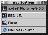
The Keeper of the iBookThe Application SwitcherBy Mark Newhouse, <ibook_keeper@mac.com> It's all about efficiencyI am always looking for ways to eliminate any unneeded actions when I am using the computer. I hardly ever use the application menu at the top right corner of the menu bar, instead I simply click on a window in the application I want to use next. Sometimes it isn't possible to find a window in the application I want - particularly on a smaller screen, like the iBook's 800x600 screen. And, especially when using a trackpad, it gets tedious to move the cursor to the application menu and click, move the mouse to the desired application, and click again, to bring the application to the front. Fortunately there is a better way to do this. Enter the Application SwitcherI am not a big fan of the Windows task bar, as it quickly gets crowded, losing its functionality. I guess that is why I never got excited about similar utilities that have been written for the Mac. I do, however, like having one-click access to any open application. This is why Apple's built-in tear-off application menu, or Application Switcher, suits me fine. What is it?The Application Switcher is basically a floating button bar that allows you to switch between applications with a single click. You create one by tearing it off of the application menu at the top right corner of the menu bar. Drag your cursor down and off of the bottom of the menu and you'll see an outline of the menu. Release the mouse and the Application Switcher will show up as a window, or palette, that floats above all of your other windows. 
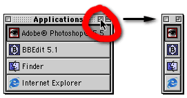
The trade-off for this convenience and efficiency is that it takes up screen real-estate; and to be functional, it needs to float above everything else, meaning it will obscure part of whatever window over which it is floating. There are two ways to deal with this. One would be to click the windowshade button at the top right of the Application Switcher window. This means you have to make an extra click when you want to switch applications, so I prefer to modify the size and orientation of the Application Switcher window itself. As a Graphical User Interface, the MacOS uses icons ubiquitously. Double-click an application's icon to launch it; the icon shows up on the menu bar (as the top of the application menu) when it is the active application. And the icons also show up in the Application Switcher window. Because these icons are closely associated with their applications, you really don't need the application name next to the icon in order to differentiate between them. 
Apple realized this and allows you to get rid of the application names in the Application Switcher window simply by clicking the zoom box in the upper right corner of the window. Without the application names in the window, the vertical orientation of the Application Switcher is now a little less efficient. Our eyes are set horizontally in our heads, and are better at scanning left and right rather than up and down. So I have modified my Application Switcher to look like a button bar across the bottom of my screen: To switch the Application Switcher's orientation between vertical and horizontal, simply hold down the Option key and the Shift key and click the zoom box. Option click the zoom box to toggle between large and small icons. You can set up any combination of these display options to suit your own personal taste and needs. More HelpFor more information, including a number of AppleScripts that further modify the look and behavior of the Application Switcher (including anchoring it to one side of your screen or another, and changing the sort order of the applications), choose Mac Help from the Help menu (while in the Finder). Click Files and programs on the left, and then Switching between open programs on the right. To Efficiency. Mark Newhouse is the Web Designer for the public outreach arm of the National Optical Astronomy Observatories in Tucson, AZ, where he really isn't as efficient as he would have you believe. The iBook image is courtesy Apple Computer, Inc. The iBook icon is courtesy the Iconfactory. |
|
Keeper of the iBook Copyright © 2000, Mark Newhouse, all rights reserved

