
Liberal Bias
John Gruber, at Daring Fireball, links to this chart at the NY Times: Bulls, Bears, Donkeys and Elephants.
Gruber’s comment:
“Facts continue to hold a liberal bias.”
Perhaps. But in this case the entire picture was not presented. What was the inflation rate under each of these presidents? How was the standard of living affected under their terms?
It would be helpful to see the graphs presented in date order to identify trends - for example the only Dem to beat the Dem’s average was Clinton, and he came into office on the trail of Reagan and Bush I, who along with Ford and Eisenhower all beat the Dem’s average. So I grabbed the chart and rearranged some things.
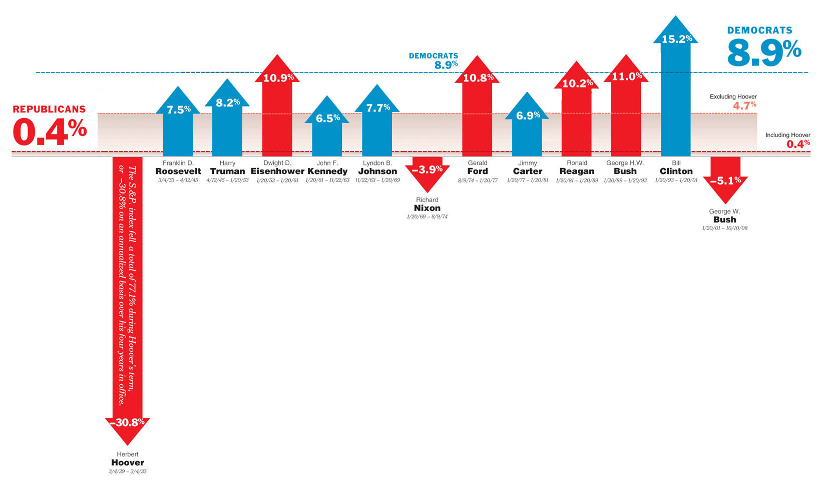
Click to enlarge - note: this is an updated chart provided by Kevin O’Shea. My clumsy attempt is here so you can see what all the commenters were giving me grief about.
The first thing I noticed was that in the original graphic, the scale was different for the Republicans and the Democrats. This may have been due to the large arrow needed for Hoover, but it resulted in me having to scale down the Democrats’ arrows. Then I noted that the dashed lines indicating the averages for the two parties was located differently for each party’s arrows.
I can’t say is this is deliberate bias or not, but that is why things look a bit odd in my reinterpretation of the chart.
Looking at the (new) chart we can see that every Dem, save Clinton [update: and Roosevelt], has a lower average annualized return than the Republican that preceded him. And Clinton’s rise was built on 12 years of a strong Republican economy
We ought also to look at the makeup of Congress during these terms. Bush II is doing miserably, but the most egregious of the problems in his term have been under a Dem controlled legislative branch.
I do not know the answers to any of these questions, but without further analysis I think we could say,
“Facts presented with a liberal bias continue to paint a picture that appears to support the liberal agenda.”
Not quite as pithy, but perhaps more accurate.
Update—I have posted a follow-up: Bias, or Propaganda?
More Like This
By Category
- Apple
- CSS
- Christianity
- NaBloPoMo
- cycling
- design
- digital photography
- digital video
- family
- fitness
- iPod
- meta
- politics
- random
- speaking
- web standards
- writing
Recent Posts
- Bias, or propaganda?
- Liberal Bias
- A key to success in the marketplace?
- 100!
- 100 push ups, week 6, day 3
Monthly Archives
- October 2008
- July 2008
- June 2008
- April 2008
- March 2008
- January 2008
- December 2007
- August 2007
- December 2006
- November 2006
- September 2006
- July 2006
- March 2006
- February 2006
- October 2005
- September 2005
- August 2005
- July 2005
- May 2005
- April 2005
- March 2005
- February 2005
- January 2005
- October 2004
- September 2004
- August 2004
- July 2004
- June 2004
- May 2004
- April 2004
- March 2004
- February 2004
- January 2004
- December 2003
- November 2003
- March 2000-August 2003
Comments
this is such BS — I supposed Clinton and the Dems were personally responsible for the dotcom boom? while Bush was personally responsible for the following bust? What a load of horsepuckey
Take the Clinton/Bush periods out of the mix, which had nothing to do with them, and the Repubs TROUNCE the dems
Posted by: Joe on October 16, 2008 03:44 PM
Is there a reason you incorrectly scaled the democrats with respect to the republicans? 15.2% is a helluva lot bigger compared to 11.0% than you show on your graph.
Annualized return needs to be compounded. You’re showing linear relationships here, which is nonsense.
You brought up the rate of inflation (putting this into real dollars) but didn’t actually BOTHER to scale for that.
Posted by: Foo on October 16, 2008 03:44 PM
“We ought also to look at the makeup of Congress during these terms. Bush II is doing miserably, but the most egregious of the problems in his term have been under a Dem controlled legislative branch.”
Irrelevant, Presidents don’t sign bills they don’t support. One can blame the Congress under a particular president, but they almost always put forth a bill that the President supports.
Posted by: Jim on October 16, 2008 03:49 PM
Laying this out chronologically. It also looks like we’re in for growth under the next 5 presidents, regardless of party.
Posted by: Larry on October 16, 2008 04:02 PM
“Looking at the (new) chart we can see that every Dem, save Clinton, has a lower average annualized return than the Republican that preceded him.”
You forgot Roosevelt and Truman, of course.
That makes three Democrats with a worse average and three with a better average than the preceding Republican. Going the other way, the Republicans have four better and three worse (counting Hoover).
Posted by: g on October 16, 2008 04:24 PM
Why are your red arrows fatter than your blue arrows?
Posted by: anonymous on October 16, 2008 04:24 PM
There is a problem with your chronological representation.
That problem is that you give seemingly arbitrary widths to each president (eg: Nixon’s bar is wider than FDR’s bar even though FDR’s average was over a longer period of time).
If you are truly doing a comparison based on chronology it would make sense to have your x-axis be what you’re actually comparing against (that being time) instead of being based off names. Names are far more biased of a unit when it comes to recording time than, say, years.
Posted by: Daniel on October 16, 2008 04:25 PM
Did you scale the Dem’s arrows down too much? Clinton at 15% should be significantly higher than Bush I at 11%.
Posted by: g on October 16, 2008 04:26 PM
Foo (if that is your real name):
Read the post again and you’ll see why things are scaled the way they are.
The original chart showed the linear relationships. All I did was rearrange things. Again, read my post for more.
If you BOTHER to read my post (sensing a theme, here) you’ll understand that I have a lot of questions about the original chart, none of which I claim to have answers to. There was one thing I could do and that was to rearrange the original chart into chronological order. So I did that. I’m sorry if you don’t like the results.
Posted by: Mark Newhouse on October 16, 2008 04:29 PM
Jim:
Irrelevant. Congress can pass any vetoed law with a 2/3 majority.
I kid of course. the point of my post is that the original NY Times chart gave an incomplete picture, and a few minutes in photoshop rejiggering the thing and suddenly there are more questions than answers.
Posted by: Mark Newhouse on October 16, 2008 04:37 PM
Larry:
Past performance is no guarantee of future results.
:)
Posted by: Mark Newhouse on October 16, 2008 04:39 PM
Bravo! Thanks for re-arranging this. My personal opinion is that in our three branch government (not to mention the separate Federal Reserve system controlling money supply) the president can’t do much for the economy.
The other thought I had when I saw the original was what Alan Greenspan said of Pres. Clinton “”Was the Best Republican President We’ve Had in a While”
Posted by: DanH on October 16, 2008 04:39 PM
Daniel:
Good point. However I am simply rejiggering someone else’s chart, and his had some problems that I attempted (rather clumsily) to overcome in scaling the Dems down.
All of this simply adds weight to my argument that this data (the facts), in the original chart, are being misrepresented to show a liberal bias. I make no claims about whether the misrepresentation is intentional or not.
Posted by: Mark Newhouse on October 16, 2008 04:43 PM
DanH:
You are welcome. Funny quote from Greenspan.
Posted by: Mark Newhouse on October 16, 2008 04:45 PM
I like that this was rearranged, but you mention that you scaled the Democrats arrows. When Foo mentioned that these were scaled incorrectly in the comments, you said that you didn’t scale them at all.
Truth is, these are not properly scaled (whether you did it or not), and seeing this is a central point of your argument against this graph, it seems odd you would continue the error, just now in the opposite direction.
Posted by: NZ on October 16, 2008 04:46 PM
Of course, the biggest bias is starting the time period at 1929.
Posted by: Henry on October 16, 2008 04:47 PM
The chart from the NYTimes was simplistic and intended to be as such to make the simple point. You’re basically critiquing the graph by saying the over simplistic nature is a flaw because when you do some crude photoshopping the graph looks ridiculous. I don’t really understand how your reinterpretation of the graphic helped make your point of bias at all. I threw a relatively simple excel spreadsheet together that illustrated the chronology aspect together in minutes, probably the same amount of time it took to rescale the democrats and reorder. The added bonus was that it was to scale. All this under the guise of comparing the data using chronology rather than party affiliation. I’m sorry, I don’t buy it. If you want to do a comparison based off a variable do it right and set the example.
Posted by: Daniel on October 16, 2008 04:52 PM
I am a fan of DaringFireball in so far as it relates to Mac nerdery etc.
However Gruber’s liberal bias drives me nuts - almost a Ballmer-esque “this cannot be debated” slant when it comes to barracking for Obama.
In the course of a week he linked to a pro Obama article implying McCain voters are stupid, and then linking to an article on Steve Ballmer ridiculing him for saying “these things cannot be debated”.
Breathtaking, really. (although he is gracious enough to link to this site too)
Posted by: Hamish on October 16, 2008 04:57 PM
NZ:
Hmm, I thought I just asked him to re-read my post.
Actually I am not so concerned about the hight of the arrows. I could have scaled the Repubs up to match the Dems, or just left everything the same. The numbers are there for more accurate comparisons, or if someone wants to recreate my redone graph, and include width for time in office, etc. My point is just that the presentation of information can lead to a perceived bias. I think I’ve demonstrated that…
Posted by: Mark Newhouse on October 16, 2008 05:03 PM
Daniel:
Please post your new graph - I’d be happy to link to it.
As for my problems with the original chart - I think it was too simplistic to be valid. The conclusions may be correct, but the chart is not telling the whole story.
Posted by: Mark Newhouse on October 16, 2008 05:12 PM
Let’s not kid ourselves. There are lies, damned lies, and statistics. Anyone can work a number to fit their views. It sickens me when people, mainly conservatively biased news outlets, criticize anything that doesn’t present things their way as liberally biased. At the same time, they argue they should let others decide when the finger is pointed back at them. The mainstream media caters to a populist mentality that is neither liberal or conservative. I’m not saying a populist mentality is necessarily good, but it hardly caters to corporate types, economics junkies, etc. Perhaps populism can be seen as liberal bias, but I like to think of it as money bias. Reporters report what sells.
I wish we could all move past partisan boundaries and agree that sometimes a Republican president is what the country needs, and sometimes it’s a Democrat we need. Instead, we needlessly bicker about why one philosophy is superior. Ultimately, the middle class decides what they need in the moment. I’d argue that when times are good, fiscal conservativism is followed, when bad, a more socialized approach is taken.
Facts are facts. It is conclusions that are biased. I think Gruber was being tongue and cheek when he made his comment, Mr. Newhouse. You took the bait.
Posted by: RamJaw on October 16, 2008 05:23 PM
Mark, it appears what you’ve done here is replace one set of biases with another. The original chart is a load of garbage—the scales are subtly skewed in such a way that they create a bias, whether intentionally or not. I had to measure myself after reading your first comment because it’s not an obvious detail. But redrawing the chart with blue arrows that are smaller than the red ones just inverts the bias. Furthermore, you’ve added confusing chartjunk by putting blue and red gradient boxes behind the arrows, presumably to remind viewers of the parties’ averages. Then, on top of that, you still don’t have the scale right—Hoover’s -30% is much more than twice the size of Clinton’s +15%.
You’re awfully snippy to the critics who are clearly responding to the irresistible piece of bait you’ve set out here. You could have done a better job of pointing out the bias in an UNbiased way, had you just corrected the facts instead of swinging the pendulum in the other direction. You would have made a stronger impact, and you wouldn’t have to defend yourself by changing the basis of your argument a dozen comments later.
Posted by: Redacted on October 16, 2008 05:33 PM
Leaving aside the questionable tactic of using stock price of 500 companies to indicate economic health, I’m curious why they chose 1929 as the start. The S&P 500, according to Wikipedia, was created in 1957 but has been taken back to 1923. It seems like eliminating the Roaring 20s, called so more for economic growth than ambient loudness, would eliminate two Republican presidents that might upset the propaganda value of this chart considerably.
Posted by: Bill Brown on October 16, 2008 05:42 PM
Having been a long-time reader of DaringFireball, I seriously doubt Gruber was being tongue-in-cheek. As a previous poster said, while Gruber’s Mac commentary is usually pretty good, his political posts are just a little nutty.
But that aside, nice work with re-arranging the chart, Mark. I thought the original graph looked a little suspicious, but it wasn’t until I saw this re-arrangement that I realised just how misleading the original was. A lesson in the use (or misuse) of informational graphics, I suppose.
But ultimately, the graph is inherently flawed due to its shallow representation of information. You mentioned inflation, but that’s just one factor out of many dozens of things that can affect the economy for good or bad and which are largely out of the hands of presidents. Nixon, for example, was blind-sided by the 1973 oil crisis, the fault of which could hardly be laid at his door. Clinton was president at the time of a technological revolution in the US, in which productivity rose significantly, yet he can’t take much credit for that either. Were it not for WWII, FDR’s arrow would not have been nearly so impressive.
So while each of these presidents undoubtedly made decisions that had some effect on the US’s economy while they were in charge, for the most part the economic events of their time were shaped by events and people outside their control. The better presidents (economically Clinton was one of them) stepped aside at the right times mostly. But without showing any of the context of the times, of the political makeup of Congress, the advent of major wars and international crises and so on, the graph has no real value, except to be used by the Grubers of this world to reinforce their own particular bias.
Posted by: Darren on October 16, 2008 05:47 PM
Actually, I think you made a significant error in the scaling that you may not have realized. The arrows on the original chart were all correct relative to one another. The error on the original chart is on the Republican chart, the blue dotted line reading ‘Democrats 8.9%’ is in the wrong place - the line actually marks about 6.8% on the relative scale.
You matched the (incorrect) lines up, which throws all of the arrows off relative to one another (height as well as thickness)
I’ve emailed you a corrected chart.
Posted by: Kevin O'Shea on October 16, 2008 06:30 PM
Perhaps I’m missing something, but wasn’t the graph supposed to support the numbers, namely, that if one had invested $10,000 in the S+P 500 during GOP vs Democratic administrations, one would have:
$11,733 or $51,211
vs
$300,761?
If anything, the chart does a bad job of showing how compound interest can turn .4% or 4.7% into a whole lot less money than 8.9%. That’s not a liberal bias, it’s just a problem with how to frame the information correctly. I’d suggest having the dollar amounts listed on top of each arrow, personally.
Posted by: Edward on October 16, 2008 06:40 PM
Correlation is not causation.
Posted by: Bret on October 16, 2008 08:53 PM
In case anybody is interested, I’ve put together a simple graph in which all arrows are actually drawn to scale:
http://img337.imageshack.us/my.php?image=snpdemsvsrepsbi8.png
Turns out, the democrats don’t look too bad if their arrows are not artificially scaled down. ;)
Mark’s note: see Kevin’s updated chart:
http://gnuhaus.com/iblog/images/TimeBasedChart2.jpg
Posted by: lionel77 on October 16, 2008 11:02 PM
RamJaw:
Maybe you took my bait?
BTW, I agree with you that facts are facts, and we bring our biases into any conclusions we draw. But don’t assume make any assumptions about my political leanings based on this post. I’m just calling out the Times and Tommy McCall on poor information design that reveals their liberal bias (as opposed to the facts somehow having a liberal bias).
Posted by: Mark Newhouse on October 16, 2008 11:05 PM
Readcted:
You make some good points.
I can’t disagree with what you have said here. I’ll be posting a new graph drawn by someone with more time than I had, that accurately reflects the arrow lengths so people can get past that issue. It wasn’t my intent to make the Dems look worse, I thought I was rescaling correctly (silly me, assuming the former information graphics editor at Money Magazine would draw things to scale when trying to create a graphic that conveys information).
I added no chartjunk - it’s all Tommy McCall’s. I only cut and paste (after my misinformed scaling).
I have not changed the basis of my argument. In fact I did not present an argument, only made some observations based on rearranging the data into chronological order. And then asked several questions that I admitted I had no answers to.
If you think I’m being snippy you must be new to the internet. :) I only chided people for not reading my original post and jumping to conclusions. I also wonder how many poeple who have jumped on my chart looked at the original chart and made any kind of comparison.
Posted by: Mark Newhouse on October 16, 2008 11:19 PM
Kevin:
You Rock! I’ve posted your updated chart (and left a link to my clumsy one for posterity) in the post above.
As far as I’m concerned, this doesn’t change my observations, and gives a correct view of the Dems’ numbers (and it really was not my intent to make them look bad, I just wanted to see how putting things in chronological order would affect the interpretation). So thanks.
Posted by: Mark Newhouse on October 16, 2008 11:36 PM
Edward:
Yep - and it does show that. But why make that chart and why now? Only a fool would use this kind of investment strategy, so it isn’t investing advice. I realize there is an election happening soon, and that the economy is an important aspect, but what relevant information does the original chart bring to the table? All it really does is demonstrate the liberal bias of the Times and Tommy McCall.
Posted by: Mark Newhouse on October 16, 2008 11:46 PM
Perhaps I’m missing something, but even with your original uneven scaling, this still comes out in favour of Democrats. Almost half the Republicans screwed up. None of the Democrats did. And while the five “bad” Democrats are behind the four “good” Republicans, they aren’t that far behind them.
I think the original point of the NYT post was that a lot of people vote Republican because they assume that Republicans are good for the economy, while Democrats are bad. The data (at least for the development of the stock market) doesn’t seem to support that assumption, whether you use the old graph or your new one.
Looking at the - obviously limited - data, the choice seems to be between a steady but possibly smaller growth, and a higher risk with a possibly higher payoff. On average, so far, you’re more likely to win with a Democrat.
Posted by: LKM on October 17, 2008 01:07 AM
As a loyal WaPo reader, I certainly think the Times is biased. But as any good media student will tell you, it’s not a political bias, but a institutional bias: preferring the horse-race to issues, staying with “narratives” over real news, and preferring soft fluffy feature pieces to hard news.
This chart reflects all of those biases: it isn’t real news, it taps into a narrative (that political parties control the economy in a easy-to-see way) and it doesn’t dig down into the details to explain that the issue is much more complicated.
Those aren’t liberal biases. I’m sure that if the reporter had started the calculation later, and came to the conclusion that the GOP was better, they’d have printed those numbers.
Like bad scientists, reporters often write their conclusions first. Then they go back and massage the words/data to fit their point. There’s nothing political about it, but it’s still shoddy journalism. Which is actually what the Times (thanks to Judith, etc) does on a regular basis.
Give me the WaPo any day!
Posted by: edward on October 17, 2008 06:45 AM
What you neglect by injecting conservative bias to shade the 15.1% Clinton growth was that the economy was in recession from June 1990 under Bush I. That recession outlasted him so the 8 Clinton years weren’t a continuation of the Reagan/Bush I years. It was a new cycle.
While Clinton wasn’t directly responsible for the dot com bubble, the deregulation that took place under Reagan fueled that and set the stage for our present problems. Bush Junior only added gasoline to the fire.
Posted by: Buzz Lightyear on October 17, 2008 08:54 AM
Buzz:
I’ve updated the chart to accurately reflect arrow lengths, so there is no longer a “conservative bias” in the new chart. In fact I never intended to inject any new bias into the chart, simply to arrange it in chronological order to see if that gave any new insight.
Your assertions about the economic cycles are not evident in this data, which is essentially my point. The data is so incomplete, and so poorly presented in the original chart that to try to draw any conclusions is foolish.
Gruber points to a better model that includes more data, and which he says makes the Republicans look much better. Unfortunately the blog is down so I have not been able to take a look. But it apparently answers many of the questions I raised. Here’s the DF post:
http://daringfireball.net/linked/2008/10/16/mathematica-stocks
Posted by: Mark Newhouse on October 17, 2008 09:21 AM
Edward (and others):
Just a quick reminder that it was Gruber’s assertion that the facts had a liberal bias that I was responding to. As has been stated, facts are what they are. It’s our interpretations and the conclusions we draw based on them that are biased, one way or another. And the presentation of those facts intensify that bias…
Posted by: Mark Newhouse on October 17, 2008 09:24 AM
I’m aware you were responding to Gruber. Yet you responded in the comments by saying:
“Im just calling out the Times and Tommy McCall on poor information design that reveals their liberal bias (as opposed to the facts somehow having a liberal bias).”
Gruber’s point about the facts is made tongue-in-cheek, since obviously facts can have no bias. Your point about the Times, however, is something that is not tongue-in-cheek. Saying the Times (or McCall) are biased liberals ignores the very real institutional biases both the NYT (and most likely McCall) exhibit.
If the presentation of the chart makes you draw the conclusion that the NYT is biased towards liberals, rather than biased towards horse-race/narrative/shallow reporting, then I feel like you’ve drawn the wrong conclusion, and amplified a meme (that the NYT is run by sneaky liberals!) that is inaccurate. I certainly didn’t read Judith Miller’s bizarre Chalabi-hyping in the NYT and conclude “well, the NYT must have a conservative bias”. Instead, the proper conclusion to draw is that they don’t edit their reporters (or charts) well enough.
Having said that, the only way to get the NYT (and other media outlets) to report properly is to critique them, as you’ve done. That’s why a good ombudsman (like the WaPo used to have, Michael Getler…rather than their current one, or any of the NYT ones) pushed back against items like this. Kudos to you for publishing it!
p.s. the new chart makes your point even better; I think Tufte would be proud.
Posted by: edward on October 17, 2008 09:43 AM
edward:
Thanks for clarifying your point. I’ll agree with you, but you might be interested in my follow-up post, where I push a little harder:
http://gnuhaus.com/iblog/archives/000389.html
Posted by: Mark Newhouse on October 17, 2008 10:15 AM