
Bias, or propaganda?
Yesterday I came out of hiding to respond to an assertion the John Gruber made about a simple chart from Tommy McCall (former information graphics editor for Money Magazine) and the New York Times. John posted a follow up link to my post on his popular blog, Daring Fireball. This led to my humble post becoming possibly the most read, and certainly the most commented on, post on this blog.
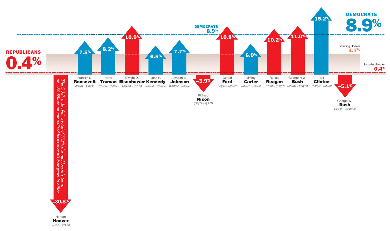
In my post I rearranged the data from the McCall’s chart to put it into chronological order. In doing so I noticed a discrepancy between the data for the Republicans and those for the Democrats. I was in a hurry and so tried to scale things to get everything to fit. I wasn’t worried about the heights of the arrows so much as what things looked like in this different ordering of things.
This turned out to be a mistake. In my haste I introduced additional bias in the data. I regret the error.
I really do regret the error, because it colored many people’s responses to the post. I have since updated the post to link to a more accurate version of the chart, created by one of the commenters, and I appreciate his efforts. The new, improved chronological chart does not change any of my observations about the data, nor does it do much to answer most of my questions. John Gruber pointed to another blog that potentially answers those questions, but the blog has been down since last night. I hope to be able to view it soon.
Update: The post was available for a short time this morning and it tells me that I asked the right questions (inflation is an important thing not to ignore!), and further strengthens my position below.
That brings me back to the original chart. At least one commenter on my post mentioned the “P” word — propaganda. So I took a look at what propaganda really is. From Wikipedia:
“Propaganda is a concerted set of messages aimed at influencing the opinions or behaviors of large numbers of people. As opposed to impartially providing information, propaganda in its most basic sense presents information in order to influence its audience. Propaganda often presents facts selectively (thus lying by omission) to encourage a particular synthesis, or gives loaded messages in order to produce an emotional rather than rational response to the information presented. The desired result is a change of the cognitive narrative of the subject in the target audience to further a political agenda.”
Let’s break this down sentence by sentence and apply it to the Times/McCall chart.
“Propaganda is a concerted set of messages aimed at influencing the opinions or behaviors of large numbers of people.”
The chart, published in the NY Times, was certainly aimed at large numbers of people. It certainly had a political bias, and given that it was published in the opinion section I think we can make the case that it was designed to influence the opinions of these people.
“As opposed to impartially providing information, propaganda in its most basic sense presents information in order to influence its audience.”
This data was clearly not presented in an impartial manner. There were many things wrong with where the lines representing the average annualized returns for both Republicans and Democrats were drawn. There is some question about how precisely the arrows were drawn, and the data was arranged to draw a particular conclusion.
“Propaganda often presents facts selectively (thus lying by omission) to encourage a particular synthesis, or gives loaded messages in order to produce an emotional rather than rational response to the information presented.”
The data was selected to include the great depression, but not the decade of prosperity leading up to that crash. Dividends were ignored. Inflation was ignored. Composition of Congress was ignored. An emotional response was evoked - “look how much you would have made investing under Democrats!”
“The desired result is a change of the cognitive narrative of the subject in the target audience to further a political agenda.”
I can’t speak to the desired response of Tommy McCall, but given that we are less than three weeks from electing the next President of the United States, and no one in their right mind would use this as investing advice, I can guess that this was an effort to sway votes toward Obama.
A small part of a larger “concerted effort.”
So, is it propaganda, or just poor chart making? You’d think a former information graphics editor for Money Magazine would do a better job with the chart, but maybe that is why he’s the former editor…
More Like This
By Category
- Apple
- CSS
- Christianity
- NaBloPoMo
- book review
- cycling
- design
- digital photography
- digital video
- family
- fitness
- iPod
- meta
- politics
- random
- speaking
- web standards
- writing
Recent Posts
Monthly Archives
- November 2008
- October 2008
- July 2008
- June 2008
- April 2008
- March 2008
- January 2008
- December 2007
- August 2007
- December 2006
- November 2006
- September 2006
- July 2006
- March 2006
- February 2006
- October 2005
- September 2005
- August 2005
- July 2005
- May 2005
- April 2005
- March 2005
- February 2005
- January 2005
- October 2004
- September 2004
- August 2004
- July 2004
- June 2004
- May 2004
- April 2004
- March 2004
- February 2004
- January 2004
- December 2003
- November 2003
- March 2000-August 2003