An inspiration apart
Inspired by Cameron Moll’s Nodes of Design Inspiration, I’ve decided to explain my most recent redesign in a similar manner. In my case many of the design nodes come from various articles at A List Apart.
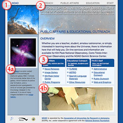
The site in question is the National Optical Astronomy Observatory’s Office of Public Affairs and Educational Outreach. I’ll briefly highlight the sections indicated in the screenshot below.

- The page uses a 2 column, centered, fixed width background, controlled by CSS via a technique very similar to that explained in Dan Cederholm’s excellent article, Faux Columns.
- The top menu uses techniques described in my own article, Taming Lists.
- These Definition Lists are styled with a modification to Dan’s Mountaintop Corners, and use the Floating Thumbnails technique in my own Practical CSS Layouts.
- Parts a and b are accomplished via Dan Benjamin’s A Better Image Rotator. I have modified his PHP to accept a caption, so the image on the left sidebar and its associated caption (4a) are served randomly. The image on the bottom of the page (4b) faithfully follows Dan’s recipe.
Let me know what you think!
About this post
In which Mark notes the influence of A List Apart magazine on a recent redesign he has done...
September 27, 2004 | design
More Like This
- Change 2.0
- Obligatory SXSW post
- That home made paper look
- I’d give it a D-
- Kitt Peak Public Observing Programs
By Category
- Apple
- CSS
- Christianity
- NaBloPoMo
- cycling
- design
- digital photography
- digital video
- family
- fitness
- iPod
- meta
- politics
- random
- speaking
- web standards
- writing
Recent Posts
- Liberal Bias
- A key to success in the marketplace?
- 100!
- 100 push ups, week 6, day 3
- 100 push ups, week 6, day 2
Monthly Archives
- October 2008
- July 2008
- June 2008
- April 2008
- March 2008
- January 2008
- December 2007
- August 2007
- December 2006
- November 2006
- September 2006
- July 2006
- March 2006
- February 2006
- October 2005
- September 2005
- August 2005
- July 2005
- May 2005
- April 2005
- March 2005
- February 2005
- January 2005
- October 2004
- September 2004
- August 2004
- July 2004
- June 2004
- May 2004
- April 2004
- March 2004
- February 2004
- January 2004
- December 2003
- November 2003
- March 2000-August 2003

Comments
Hot! The overall design echoes another site you did recently, no? (too lazy to find it at the moment). I like the addition of the rotating image with extended caption. Any chance we’ll see the code changes you made?
Posted by: CM Harrington on September 27, 2004 04:05 PM
Yeah, you are probably thinking of the Advanced Observing Program pages I posted about awhile back. This is an evolution of that design, certainly. Those pages are here:
http://www.noao.edu/outreach/aop/
Glad you like it!
Posted by: Mark Newhouse on September 27, 2004 04:11 PM
Maybe we should all take cue and create very thorough resource pages such as you have done, that way no one thinks we’re stealing. It’s hard to be a completely creative designer these days.
I shall have to do that on my links page, whenever I get that abomination up & running.
<3.
Posted by: Meredith on September 27, 2004 06:03 PM
Meredith:
If I understand what you mean about resource pages, they are not so much a way to document originality, but to provide a way for people to learn from and build on what has been done.
Of course it never hurts to have a timestamp to point to…
Thanks for stopping by!
Posted by: Mark Newhouse on September 28, 2004 10:04 AM