
That home made paper look
Part of the popularity of drop shadows and the wicked worn look is due to texture. Adding subtle details such as these to a design lifts it out of the ordinary and makes it interesting and unique.
Until everyone else starts doing it…
The key in adding these details is subtlety—a little goes a long way. Don’t drop your shadows too far, and don’t add too many of them and you’ll go a long ways to assuring that your site still looks unique and stand out in the crowd. And when adding some wear and tear to your design remember, less is more. Too much and you’ll end up with garbage.
More texture
Another way to add texture is to create a subtle background image reminiscent of home made paper. The kind of paper I am thinking of is flecked with pieces of paper—pulp—of various sizes in random places throughout the paper. If you look close, you may notice the effect on this blog. One way to create such a pattern it by scanning in some sample paper. But you may not have a ready supply, or if you do, it is likely not in the right color.
Photoshop to the rescue
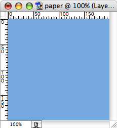
Here is how I do it. Create a new image in Photoshop, and fill it with a color that fits your color scheme.
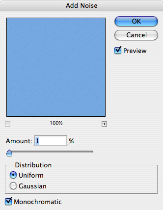
Duplicate this layer and Add Noise (Filter > Noise > Add Noise…). I use an Amount of 1 or 2%, either Uniform or Gaussian distribution and check Monochromatic. Leave Monochromatic unchecked if you want multi-colored flecks.
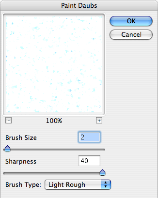
Next we’ll add a Paint Daubs filter (Filter > Artistic > Paint Daubs…). Settings here will depend on the base color you have chosen. A Brush Sharpness of 40 and a Brush Size between 2 and 5 usually does the trick. Use Light Rough for the Brush Type. Experiment until you see something you like in the preview window. We’re looking for smallish flecks on a bright background.
Once you are happy with the results you’ll want to add the flecks to your original color swatch. To do this simply change the Blending Mode from Normal to Multiply.
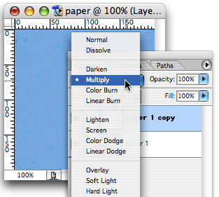
The bright areas go away, leaving the darker, random flecks.

Depending on how dark the starting color is, you may need to add one more step to the process. If you find that the “flecks” are too overwhelming, adjust the Levels (Image > Adjust > Levels…) until you get something you like.
One of the nice side effects to this technique is that it adds weight to your page. I’m not talking about the extra bytes it will add to the file size of your background gif. What I am referring to is the fact that most paper that contains these flecks is thicker and heavier than your standard white copy paper. That feeling comes across subconsciously to the viewer. Combine it with some judicious drop shadows and you’re on your way to creating the illusion of substance (something has to have some mass to create a shadow, after all). This, in turn, reinforces your message as having more substance. It’s the same reason respected companies will choose a heavier weighted paper, and quite possibly one with some texture, for their letterhead.
Lights, camera, action!
Although this technique is pretty simple, I’ve created a Photoshop Action to make it even simpler. It assumes you have your color swatch ready, and will pause at each filter, allowing you to tweak it to your specifications and design sensibilities.
Download home-made-paper.atn [653 bytes]
Enjoy!
About this post
In which Mark explains how to create a home made paper look in Photoshop...
September 22, 2004 | design
More Like This
- Change 2.0
- Obligatory SXSW post
- An inspiration apart
- I’d give it a D-
- Kitt Peak Public Observing Programs
By Category
- Apple
- CSS
- Christianity
- NaBloPoMo
- cycling
- design
- digital photography
- digital video
- family
- fitness
- iPod
- meta
- politics
- random
- speaking
- web standards
- writing
Recent Posts
- Liberal Bias
- A key to success in the marketplace?
- 100!
- 100 push ups, week 6, day 3
- 100 push ups, week 6, day 2
Monthly Archives
- October 2008
- July 2008
- June 2008
- April 2008
- March 2008
- January 2008
- December 2007
- August 2007
- December 2006
- November 2006
- September 2006
- July 2006
- March 2006
- February 2006
- October 2005
- September 2005
- August 2005
- July 2005
- May 2005
- April 2005
- March 2005
- February 2005
- January 2005
- October 2004
- September 2004
- August 2004
- July 2004
- June 2004
- May 2004
- April 2004
- March 2004
- February 2004
- January 2004
- December 2003
- November 2003
- March 2000-August 2003
Comments